JohnCh
-
Posts
3,406 -
Joined
-
Last visited
Content Type
Profiles
Forums
Store
Articles
Gallery
Events
Library
Everything posted by JohnCh
-

Transmission oil change procedure for a Caterham with Mazda gearbox
JohnCh posted an article in How-to Guides
The following article is courtesy of @CBuff and was repurposed from his post below. If you have questions or comments about the procedure, please comment in that thread. Caterham 420 5 speed transmission fluid change Figured I would share. I’m a total mechanical novice so doing a transmission fluid change is a bigger undertaking than it should be. But I think it was successful. new 2023 caterham 420r delivered last June. Put 5k miles on it since last year and 7 track days. other forums and service suggest checking your transmission fluid level at the end of the season. The only way I could figure doing this was to remove the filler plug and stick my finger in there. Since that’s the hardest part of the job I figured I would just drain it and put in new fluid. checked the square fill plug (9/16 crescent) to make sure it comes off. then removed the 24mm drain I pulled back the carpet and cut the heat shielding that covered the hole in the footwell. nothing spilled out when I opened the filler hole. About 1.5 liters came out. Black and nasty for less than a year. Mag plug had decent amount of crud on it put about 1.8 liters back in via a funnel and tube (cheap amazon). When I went to check and pulled the funnel it was dripping out of the fill so guess that’s full. decided I should put a grommet( 60cm with a piece cut since the diagonal cross brace cuts thru the hole) back in the foot well and the heat shield plug (taped from the trans side). heat shield tape to cover plug stick carpet back down I started to wonder about the turret oil. Some Miata forums say to service this by pulling the shifter out. Decided I would see if there was any oil in there. (Sorry no photos of this) pulled the tunnel cover. Removed three 8mm bolts on shifter. Removed shifter (careful it drips trans fluid). Seems like there was a little fluid way down at the bottom. Thought I would top off. It took about 200ml to fill it just over the bushing receiver ). I read it should take 250ml from empty so it was either very low or I overfilled it. here is a video of some doing this in their miata took it for a test drive and nothing was leaking etc. so success for now. Sometime down the road I will extract the fluid out of the turret but I was pushing my comfort zone and thought just topping off was enough. so I can add to my first list. Transmission fluid. (Already did the oil twice, and diff fluid ). I enjoyed the experience and learned a bunch. Starting to get just enough knowledge to be real dangerous. -
Sticky posts can quickly get out of control if they aren't held to a very high bar. However, we can turn this into an article and post it in the Owner Resources section. I will make some other changes to aid discoverability. @CBuff shoot me a PM if you want to make any tweaks to that post for the article. To the rest of you, if you have a how-to that you wish to publish in that location, please let me know.
-
I don't want to use an exact copy of the Caterham shaped 7. Period. As seen in images posted thus far, there are many other options. I don't see why we can't be more original rather than derivative, and not subliminally advocating for one brand. You are welcomed to disagree, and to publicly share that opinion, but as the person who donates their time to keep the forum running, I feel I've earned the right not to care
-
In case you split the washers evenly because that is implied in the build manual, that is not necessarily correct. When Caterham introduced the Ikea-style build manual in an attempt to make assembly appear easy, they left out information from the earlier, and more thorough written manual. In the case of the washers, the Ikea diagram shows the same number washers on either side, implying they should always be equally split. However, from page 129: "Measure from either side of the differential carrier to the outboard side of the chassis (outboard of rear ARB mount – 1” BOX) to centralise. During this process there will be a need to pull the bottom bolts out and use shim washers (item 21 in pack 30Z1067A) inserted in between the metalastic bush and carrier as necessary. You may now use the ½ x 11” top bolt (schnorr washer under the head). It is optional to grind a chamfer on the end of the bolt (threaded part 45 degrees x ½”) as this makes it easier to slide and locate the top bolt. Ensure there is plenty of copper slip used on the bolt. You will also need to space the upper bolt between the carrier and the metalastic with shim washers. Use a ½” nyloc nut and schnorr washer to fasten the bolt." You might have it centralized, but it would be good to check. The written manual is in the Library:
-
I prefer the simplicity of this one. It just needs some color.
-
The size likely impacts the shape of the torque curve and idle quality, but it shouldn't make the car undrivable. However, it is worth mentioning given you're considering replacing them.
-
With my limited skills and tools, changing the color requires a lot of work. This is all done in powerpoint and using some lightly cleaned up images found on the web. This is why we either need something created correctly by a graphic artist or cleaned up by one afterwards. That is also necessary to ensure it prints okay on various background colors. I removed the rollbar from the original image as I thought it was overly busy, and I wanted the Seven element to be more abstract than literal. See below.

-
Two variations.
-
The challenge with adding the silhouette to the left is that it becomes pretty small and can be a little hard to discern when the logo is sized to fit at the top of the forum as seen in the comparison below. Changing the outline from gray to black, however, might make that acceptable.
-
I missed that earlier. 50mm is huge for that spec. As a point of comparison, I went with that size over 52mm for my 2.4L after Raceline ran a 2.4L with 50mm on the dyno and cleared 300hp at 7500rpm. My 2.0L has 45mm Jenveys and makes 225-230hp.
-
One of my first attempts had the .net. I like that it forms the URL, but initial feedback was that it made it too busy.
-
This is why I removed the roll bar and shortened the windscreen. I couldn't find a way for it not to interfere and take over as the primary part of the graphic, rather than have it remain as the supporting piece. I have no idea if it would work -- and it's waaaay beyond anything I could even attempt -- but having the letters make up the shape of the car like the WSU logo below might be interesting.
-
@Slonie I like the play on fonts in some of your drafts pile. Are those published fonts, or did you create those?
-
I forgot about this one. I just added it to the Build Blog links thread:
-
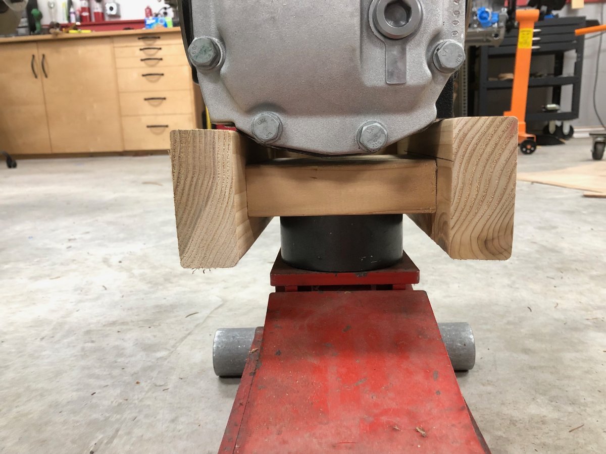
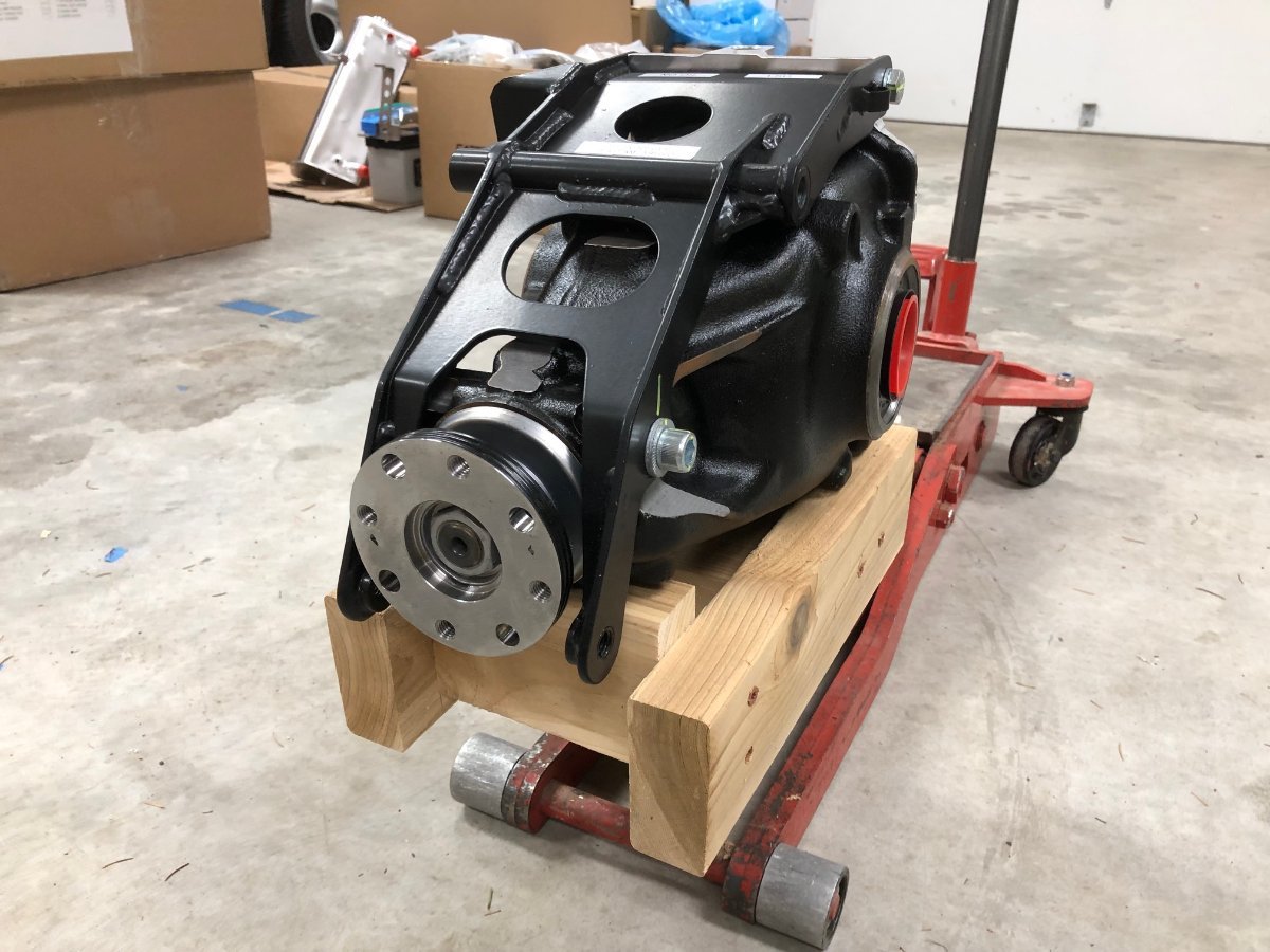
There are a few ways to do the diff, and although I'm sure it's easier with help, I did mine solo with a floor jack and a simple cradle made from scrap wood to keep it steady. -John
-
This with narrower tires, the clamshells in SENC's, and a narrower grill (S3, not SV) might be interesting. @11Budlite do you mean like this? Second version has the 7 raised a bit.
-
Not a criticism of you @KnifeySpoony, just making that clear to everyone who may try to riff off that shaped 7.
-
We do need to be careful of the shape of the 7. When I wrote there shouldn't be copyright issues, I meant that from two perspectives: (1) avoiding potential legal headaches discussed earlier, and (2) given this is a brand-agnostic forum, the logo shouldn't have elements easily associated with an existing brand. Caterham uses a very specifically shaped 7 and does have that shape registered as per the screenshot below. Being inspired by something is fine, but let's avoid crossing over to derivative territory.
-
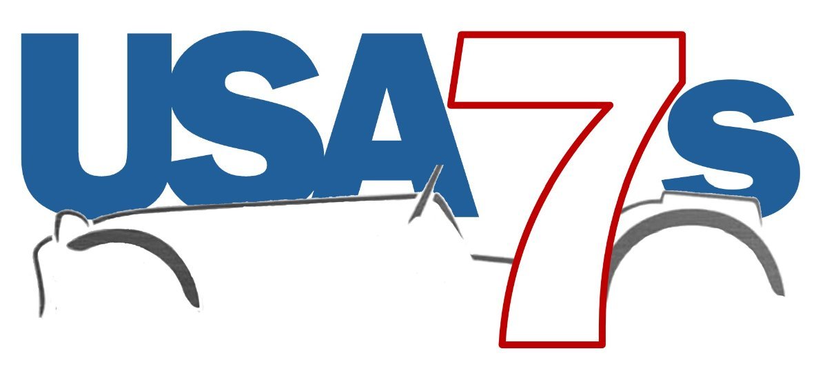
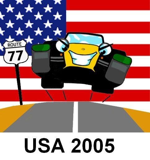
I've always liked the Se7ens.net and USA2005 logos. Sharing for inspiration. I believe I may know how to reach the person who did these. And yes, clamshells -John
-
It got bad enough that in a form of protest, the se7ens.net mailing list automatically replaced all mentions of Caterham with badgerum. It would always confuse the hell out of new people who couldn't understand why their mail would show up with that word instead of what they initially wrote. To close this out, as a person who has a vote on the final design, I can unequivocally say that I'm not in favor of a logo that borrows heavily from something that already exists. We should shoot for originality.
-
I believe that is owned by Caterham. Years ago, they went after a lot of businesses for simply using the number 7 in the name, including businesses in the UK that serviced the cars. Different ownership now, but it created a lot of churn for a lot of people. Unless you are willing to personally indemnify me from any action, and reimburse me for the time I waste dealing with it, I need a little more reassurance than the above.
-
Are you sure that logo is in the public domain? As mentioned above, I don't want to play fast and loose with copyrights.
-
The first version had clamshells, but I decided to simplify and add lightness
-
Note: I'm intentionally putting this thread in the wrong forum to maximize visibility and will move it to Forum Evolution in the future. The forum turns 20 years old this June. Two years after Mazda's (@slngsht) inaugural post on 6/10/2005, the current logo was developed for the 7-7-7 event at the Tail of the Dragon and has held station at the top of the page ever since. I think it's time for a replacement. Perhaps one a little more T-shirt friendly. The creativity and designer genes are missing from my DNA, and although I've taken a stab at a logo, I'd like to open this up to the community to see what the more artistic among you can create. A few things to consider: The logo needs to remain readable when scaled down to fit at the top of the forum pages. The design and color palette should be simple to aid printing and embroidery on clothing. The color palette should also work well with the current forum colors. e.g. no fuchsia. Bonus points if it includes an element that makes it clear this is about cars inspired by the Lotus 7 There should be no copyright issues. Rights will be donated to the club. I suspect we may have a situation where someone comes up with a winning design, but they aren't proficient with graphics software, and we'll need someone to clean things up. Therefore, there are two prizes on the table. One for the designer, and if needed, one for the person doing the graphics rework. The winner(s) will receive: The community's undying gratitude. Lifetime Club Membership. You will be moved into a newly created Lifetime Club Member user group that will exceed the Paid Club Member benefits and won't require payment or annual renewal. This will be displayed under your username and the winner(s) can even select the font color. A small gift to be named later (I have a couple of things in mind). Feel free to post your ideas here, but to make an official submission, please send a PM to both @Croc and @JohnCh with the subject line "Logo submission". We'll close this down at the end of April, but if nothing compelling comes through, we'll extend it indefinitely. Bottom line, we don't want to make a change just for the sake of change. To kick things off, here is the design I've been playing with, and which is an example of something that still requires an expert's touch to clean up and vectorize. I've included a small version to show how it works with the existing forum design and a larger one that would fit on a sticker or shirt. Keep this size disparity in mind when working on your designs. Thanks, John
-
Given how long you've owned a Caterham, you should know that incomplete or inaccurate technical information is anything but strange